The wrong way, an improvement, and the right way to do responsive design for union websites.
In recent weeks, I’ve gotten a few requests for information about a survey LabourStart did a couple of years ago. It’s odd because we’ve not done anything to publicize this. So I asked one of those who wrote to me where they’d heard about it.
It turned out it was on a website for business people, in an article about how advanced unions were in their use of the net. Author Jessica Miller-Merrell warned companies that “While HR is slow to adopt and understand social media, unions on the other hand are very open to using this online technology.”
I think anyone who has spent time working with unions and new media will smile reading that sentence.
Because even if we’ve managed to get a website for nearly every union, we still lag far behind, and run the risk of disappearing completely from the online world if we don’t catch up.
I’m thinking specifically of the problem known in the IT world as “responsive design”.
What this basically means is that every website should render correctly on every device, regardless of screen size.
There should be no need to scroll horizontally, or squint at tiny letters, or any of the other problems that might come up when trying to view a website on a phone or tablet.
If a union does this right, if its website appears correctly on a smartphone, it may not even need a dedicated app. There are huge advantages to this, as apps need to be written to work on specific operating systems (ones that work on Apple devices won’t work on Android phones) and apps can be expensive to create.
If a union were to embrace responsive design, it would already have what is sometimes called a “web app” — which is essentially a website that works correctly on small screens.
This is important because increasing numbers of people access our movement’s websites on smartphones and tablets.
16% of the visitors to LabourStart last month came on small screen devices, and 19% of the visitors to our online campaigns were on such devices as well.
This is probably because people often visit a website by clicking on a link in an email message.
As anyone who’s been on a bus in the UK in the last few years knows, millions of people now routinely access their email on their phones.
The notion of responsive design for the web was first raised in a groundbreaking article by Ethan Marcotte in May 2010.
I doubt if any trade union communication officers read it then and I doubt if many of them are familiar with Marcotte’s arguments even now.
Here is a nutshell is what he said:
“Rather than tailoring disconnected designs to each of an ever-increasing number of web devices, we can treat them as facets of the same experience. We can design for an optimal viewing experience, but embed standards-based technologies into our designs to make them not only more flexible, but more adaptive to the media that renders them. In short, we need to practice responsive web design.”
So four years after his article, and with many thousands of websites now taking on board his arguments, how do union websites in the UK rate?
Can our members correctly use their union’s website on a smartphone or tablet?
Let’s have a look.
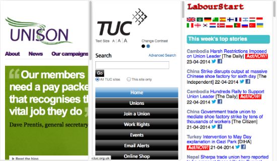
The TUC website gets it right, sort-of. Viewed on a small screen, it correctly displays just one column. Unfortunately, that column is essentially a menu of everything on the site. To see the latest news, which is prominent on the full-screen version, you need to scroll down quite a bit.
The GMB works pretty much like the TUC website, with the same problems.
The RMT to its credit does a better job, showing not a menu, but the main news story on top of the page.
But UNISON gets it all wrong. Imagine if someone printed out the UNISON home page as you’d see it on your desktop PC — and then cuts off the upper left corner, taking about a fifth of the page width. That’s what you’ll see on your phone. Click on the link to News, and you’ll see just the first few words — you need to keep scrolling left and right to see the whole thing.
Look at the websites of Unite, the CWU, PCS, NASUWT and NUT and you see the same thing: a site that just doesn’t work correctly on a small screen device. Do members of these unions not use smartphones and tablets?
Some unions, like UNISON, have invested heavily in apps for smartphones. UNISON’s app, for example, works on Apple’s iOS devices, Android phone and tables, and even on Blackberry phones (which have an absolutely tiny market share these days).
Why invest in expensive apps when a web app can do pretty much the same thing at a fraction of the price?
Why reinvent the wheel when a union’s existing website can be fairly easily adapted using the principles of responsive design?
As our union websites because an increasingly important part of how we communicate with members and with the outside world, it’s essential that we get this right.
Four years after Ethan Marcotte’s call to arms, most unions are still lagging far behind.
This article appears in Solidarity.
Hi Eric, I agree. Responsive websites are far more important than mobile apps, especially of the app is just a version of the website.
There are reasons a union may want to have an app, but it needs to be more than just a brochure. An app that allowed you to report workplace injuries, take photos, geotag and attach photos may be a start. Entitlement or wage calculators, etc. All of these would be relatively inexpensive, and to be honest should be created (or whitelabeled) by peak bodies (ACTU, TUC, AFL-CIO, etc).
Cheers
Alex
Yes – responsive sites before apps!
Retro-fitting old sites is something which happens a lot, but doesn’t produce the best results. Responsive sites are best built when the planning stage starts with the most restrictive environment (mobiles) and then expanding outwards, often referred to as a ‘mobile first’ approach.
Ethan’s book is a seminal book for developers and designers, but communications officers might get more out of the short, accessible book from the same press ‘Content Strategy for Mobile’.
There are large parts of the population who can’t necessarily distinguish between an app store and a web search so I don’t think we’ll be seeing the end of apps any time soon, but they’re more likely to become shells for responsive sites built using cross-platform technology (HTML5, CSS3, JavaScript).
I still see some the odd organisations still implementing separate desktop and mobile websites which is pretty old hat.
Spread the gospel!
Some trade unions can’t yet even manage to keep content up to date. This doesn’t help the cause.